Sussex PC
Mobile App Design
There are screens around the University of Sussex that display the quantity and location of available computers in the various IT suites and computer labs on campus.
Students could do with a mobile application allowing you to easily find these available computers whilst on the move.
User Personas
First, I needed to find what functionality would make this app most relevant and useful to its users.
Workshopping with existing knowledge of the university demographic, I defined the set of representative user personas, identifying their characteristics, technical capabilities, and goals.
Amongst these other details, it was noted how their existing practices could be changed by the use of this app.
Establishing Requirements
Basing the app’s requirements around insights from the personas ensured that they reflected the needs and goals of the users.
The app will used by most as a quick alternative to other means; it’s usefulness comes from it’s convenience. So the user journey must be quick and fluid.
The target user base is varied in type, skill level and is ever-renewing, with new students entering every year. It’s design must be intuitive for those less familiar, whilst containing intermediate elements for the more experienced user.
The user needs to be able to:
Find a computer close-by, quickly.
Have the option of a more advanced search.
The app needs to:
Have a simple design, usable by lots of new users, and by those unfamiliar with apps.
Be small in memory size, to be possibly incorporated into the Sussex App.
Storyboarding
Next, it was time to start creating solutions for the user-orientated requirements.
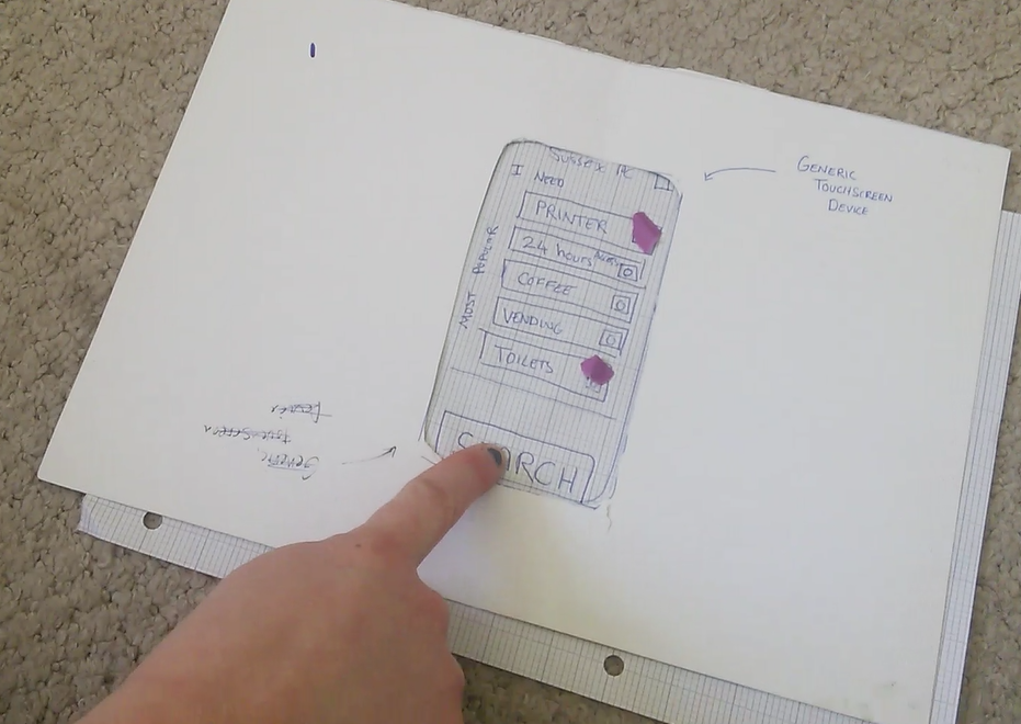
So, through sketching a low-fidelity storyboard, I mapped out ideas for the app’s functionality.
Involving a few other designers, we analysed and iterated on these designs, focusing on simplicity and good design practice, until we were content, and the process could move forward.
User Testing
It is important to get users involved early in the design phase so next, I did some user testing, using the storyboard as our paper prototype.
Instructing the participants to fulfil the persona-influenced tasks tested out the functionality that had been designed for, their questions and mistakes highlighting usability issues.
Amongst other things, this testing highlighted the need for a ‘Return to Filters’ facility from the results screen for when you “want to go back to add Nearby Coffee”.
An improvement to my process that I’ll take from this is to be less ‘involved’ in the testing, allowing the user to explore & discover with minimal guidance, and to make mistakes, as these often indicate changes to be made to the design.
Heuristic Evaluation
To further test the current design I ran it through a heuristic evaluation. The output of this evaluation was hugely valuable, from slight alterations of wording to additions in functionality.
The insights from both the testing and this evaluation can be incorporated into the next iteration.
High Fidelity Prototyping
Along with making the alterations from testing, I wanted to make the next iteration of the design at a fidelity that better resembles what the actual experience will be like.
I used Mockplus to put together this prototype and combined it with Marvel to make it easily testable, particularly on mobile devices.
One major alteration was the elimination of the home page altogether; the app now immediately shows the user the nearest computers and their facilities. This reduces the amount of in-app clicks needed for this flow to zero, perfectly satisfying that requirement.
Accessibility Testing
I wanted to check that the app was as accessible as possible.
Running it through a colour blindness simulator checked that the user journey was not dependent on colour.
It was also important to keep in mind visual impairments and reduced mobility when designing the size of content and buttons, amongst other things.
Next Steps...
To move forward with this project, I’d continue to iterate on the design, with further user testing and implementation of feedback.
The system that details how many available computers there are in various areas is already in place so the initial data exists, though development would be required to link it up on the back-end.
We’d release a live version as early as possible so that it could be rolled out and used in the real world, collecting usage data and allowing us to gather feedback on the live product that would feed into further iterations.
It's a simple app, so could be easily incorporated into the existing Sussex Uni app, adding useful functionality that would boost the use of the parent app and improve the relationship between University and user.


