Complete Mathematics
Product update
Complete Mathematics CLASSROOM is a teaching and learning platform for teachers and pupils, from across the UK and beyond.
In this project, we were updating a well implemented area of the platform — the Lesson page. Long-term user research, feedback, and behavioural data insights had identified this as a key improvement area to have a high impact on user outcomes.
User Feature Request Collation
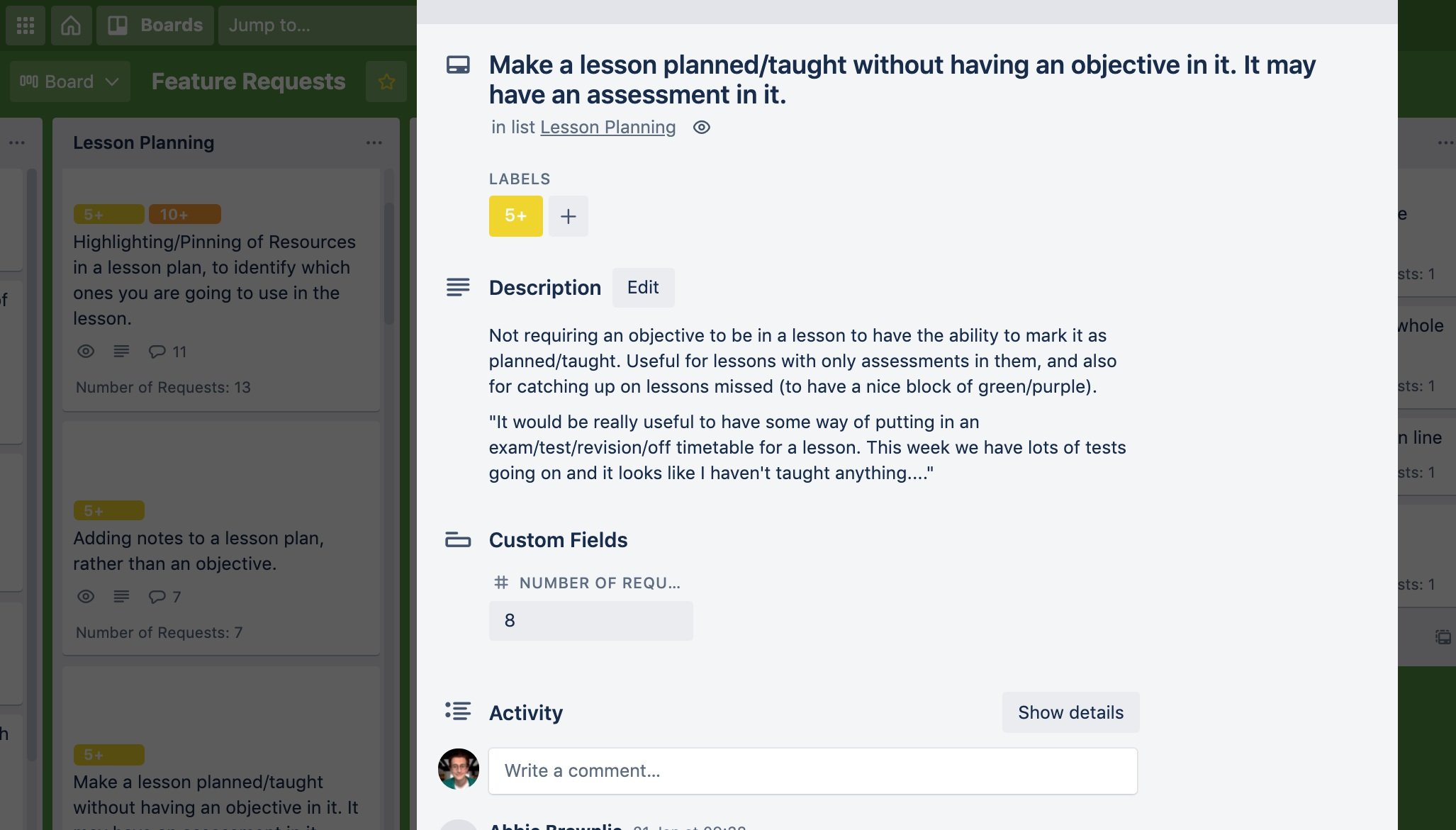
By collating user feedback and feature requests, we identified this functionality as a priority for improvement, and had a solid foundation to build our page update around. This feedback has been collected from continuous user research across various channels, including user interviews, customer support conversations, and dedicated feature request submissions.
Data Analytics
By investigating available usage data I was able to add behavioural evidence to user feedback and gain insight into the behaviours of the whole user base. This highlighted aspects beyond that which came from direct user feedback, and additional opportunities for growth.
User Feedback Survey
Drawing up proposed changes for the lesson page from our initial research, we sent out a user survey to gather more specific user feedback, as well as gaining an indication of functionality preference. The inclusion of the quantitative style questioning looked to improve the response rate, and qualitative style questions gave more scope for deeper insight from engaged users.
Specification Workshop
As a product team, we defined the user stories, goals, and requirements. This would be our blueprint to guide the design and development phases.
Sketching & Review
Proceeding with rapid ideation via sketching, I found working with mobile-device designs allowed for better divergent thinking
Presenting these sketches to our Product and Development teams remotely using Adobe XD, we discussed strengths and weaknesses of various designs, and iterated towards designs to test with users.
Prototyping
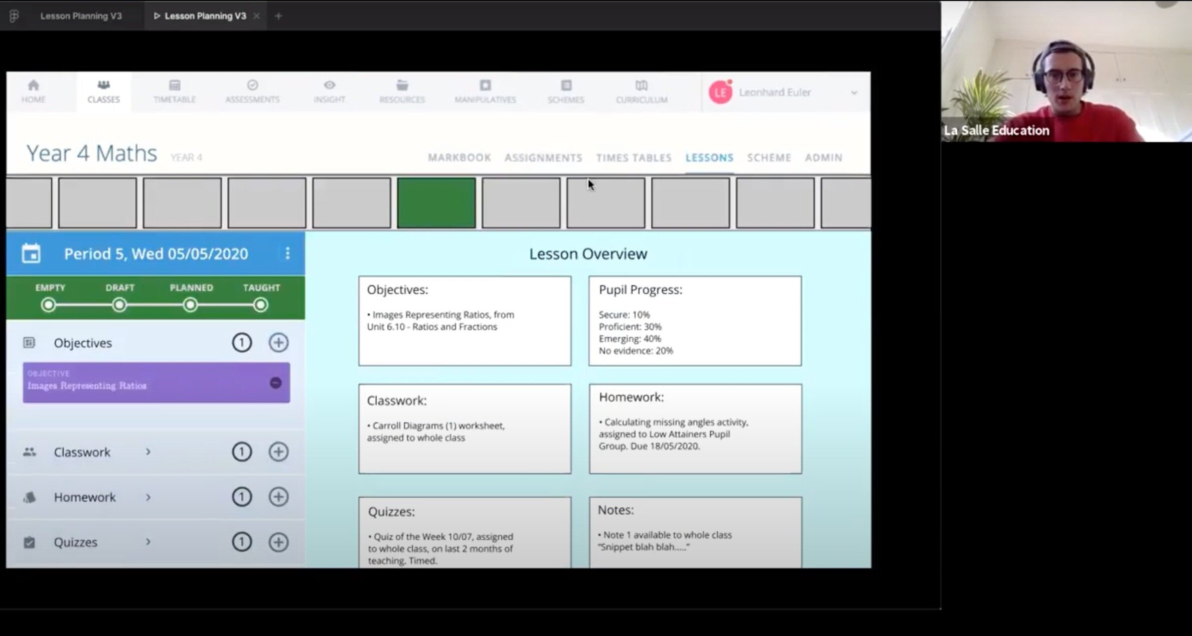
Using Figma, I quickly built a prototype to proceed into testing.
Moving to a higher fidelity design allowed us to consider more thoroughly the functionality and usability of the page, and would give a more realistic impression to users in testing which was key given how content-heavy this area of the app is.
Stakeholder Interviews & Testing
I ran remote interview sessions with maths teachers and key stakeholders in the team, testing the prototype, and discussing the old lesson page and the new specification.
We wanted to challenge/verify our design decisions so far, test the latest design against our specification, and assess the designs usability. Feedback from these sessions informed changes made in the next design iteration.
Development
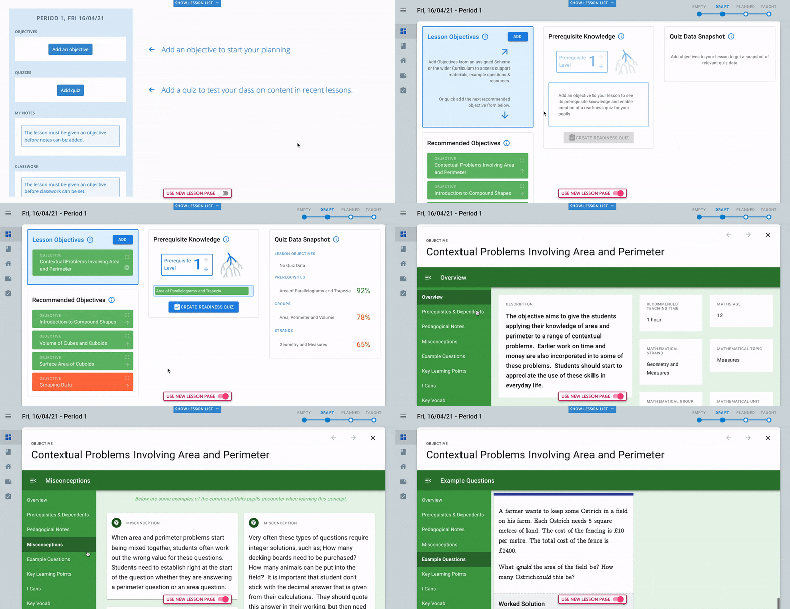
After the testing and iterations phase was complete and the latest design changes were applied, we worked with the development team to build it.
A decision was made by senior leadership to cut the deadline for this project whilst it was in development, which meant we had to reassess the design and strip it back to an MVP version, with functionality removed to a future release.
We used our earlier behavioural and survey data to identify the priority features for this first release, and adjusted the designs accordingly.
Soft Release & User Feedback
Our release strategy was built for our user demographic—to limit any disruption on teachers using the platform in live lessons. We had a soft release, with the option of switching between old & new page versions.
We embedded and sent out a feedback form for users to contact us, as well as contacting all of those whose feature requests had been implemented, from the initial research phase—both for relationship building and for further comments on the update.
We are seeing increased traffic, with more lessons planned, homework set, and quizzes created than ever before. Users are loving the newly introduced functionality and are reporting the page as far easier to use than before.
Next steps
On top of ongoing conversations with users, I am arranging interviews to dive more deeply into their use and feelings about the new functionality.
I will use all of the collated feedback received on this initial release, as well as the usage data gathered so far, to iterate on the original designs for the remaining functionality, to prepare them for the next release.
This review will also define the process of moving all users over to the new version, before then removing the old version option entirely.


